 |
we liked:
large title that summarizes poster
great for impatient attendants.
a walk-though in pictures
the image sequence in the top right summarizes the proposed technique.
The user draws with a special pen, and after erasing the content, the
content can be brought back by sweeping the PDA across the surface. This
poster is also interactive. |
|
|
 |
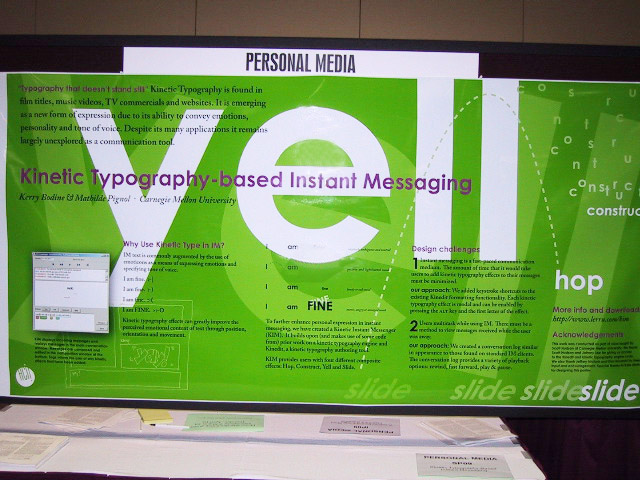
we liked:
self-referential layout
the poster is an example for its own content, i.e. kinetic typography. This
way the poster surface is exploited twice.
great attention-grabber, too. |
|
|
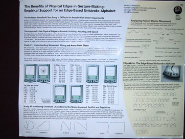 |
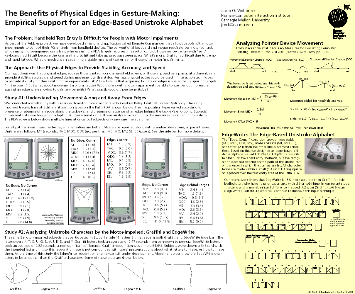
we liked:
headings that summarize their sections
glancing over these headings ("The Approach: Use Physical Edges to provide
Stability, Accuracy, and Speed") tells impatient attendants the most
relevant content. This is much more effective than generic titles or headings asking a question.
It makes a separate abstract obsolete.
limited clutter, despite a lot of information
although it holds more information that the other posters on this
example page,
this poster successfully avoids being visually overpowering. It does this by
mixing text and graphics, using few and simple colors, and working with white
space instead of boxes. |
|
|
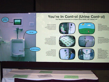 |
we liked:
one-picture summary
the huge image on the left shows the installation and gives an immediate
idea of the topic.
spoon feeding
the six blocks are self-contained, thus attendants can read in almost
any order. This poster avoids clutter by separating individual blocks with
white space. |
|
|
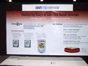 |
we liked:
bullets instead of paragraphs
all bullets are very short, making it easy for attendants to find the facts
they care about.
selective stats
the statistics section at the right is brief and limited to the most
relevant results, rather than, say, a complete table. All additional stats are
outsourced to a flyer. |
| |
|
| |
|
|
Questions? Send us email:
Patrick Baudisch, Microsoft Research
Eric Lecolinet, ENST.
|
|
| Back to:
UIST 2003 call for participation |
|


